Sunday, 30 April 2017
production Sequence..
This production Sequence was created by my self. I used NCH software called express animate. I wanted to create a simple moving logo to represent our production company. I used minimal colours such as black and white to fit film noir with just a small splash of colour to appeal and attract the audiences. I used a range of different fonts to add more character. I kept the "moonlight" in a size 16 as suppose to the "production" which is size 14 font. I wanted the moonlight to really stand out as its our main name which represents us as a group. This will be shown at the beginning of our film noir, I think it will work effective as it will tie in with the black and white theme.
call sheet
| Scene no | Location | cast | script | props |
| 1 | crime scene | no one | 0 | Scarf, Newspaper & gloves |
| 2 | detectives staff room | Jake & Kelsey | 1 | Desk,lamp,paper work |
| 3 | office | Jake & Kelsey & Fern | 2 | Desk,computer,coffee cup,reports |
| 4 | office 2 | Jake & Fern | 2 | telephone,coffee cup, hat,notes |
| 5 | crime scene/woods | Jake & Fern | 1 | Scarf,gloves, bridge |
| 6 | office/meeting | Jake | 1 | phone,evedence,lamp |
| 7 | jakes house | Jake | 0 | evedence,alcohol,desk |
| 8 | woods/bridge | Jake & fern | 0 | hate, coat, red lip |
| 9 | woods/bridge | Jake & Fern | 0 | gun |
Thursday, 27 April 2017

Sunday, 16 April 2017
my film noir poster
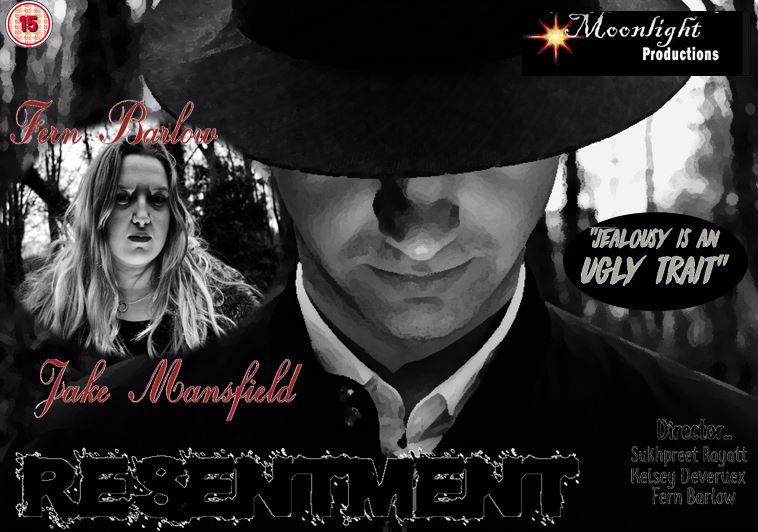
As I did all the creative rolls within this project I thought this task would be very easy for me. I looked at other existing film noir posters to gather inspiration and ideas. Most had a cartoon effect which made it more appealing to there audiences. They all include the main characters which appear on the front to show the audiences. Here I used Fern & Jake as the main characters, when positioned I enlarged Jake to fit the whole frame as I wanted only parts of his face shown and the rest hidden. I wanted him to look down as I wanted the light to project up directly to his face and create a silhouette effect from the hat. As I do A Level photography I took different camera angles and compositions to make it look more diverse and appealing to the audience. most of the posters I looked at were very vibrant and had the uses of yellows and reds.. however I wanted to keep it very dark and dull. I kept it minimal with red,blacks and greys which overall worked well. I used Da Font to get a range of fonts. I kept the resentment size 16 as I wanted it to stand out from the rest of the text. Overall im pleased with the final product and poster.
Subscribe to:
Posts (Atom)