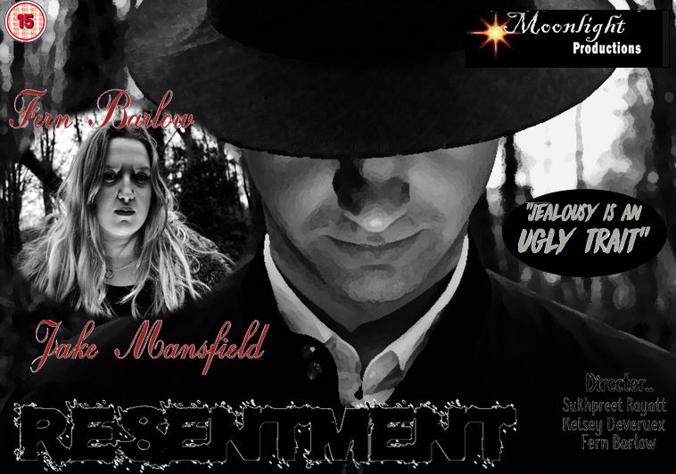
As I did all the creative rolls within this project I thought this task would be very easy for me. I looked at other existing film noir posters to gather inspiration and ideas. Most had a cartoon effect which made it more appealing to there audiences. They all include the main characters which appear on the front to show the audiences. Here I used Fern & Jake as the main characters, when positioned I enlarged Jake to fit the whole frame as I wanted only parts of his face shown and the rest hidden. I wanted him to look down as I wanted the light to project up directly to his face and create a silhouette effect from the hat. As I do A Level photography I took different camera angles and compositions to make it look more diverse and appealing to the audience. most of the posters I looked at were very vibrant and had the uses of yellows and reds.. however I wanted to keep it very dark and dull. I kept it minimal with red,blacks and greys which overall worked well. I used Da Font to get a range of fonts. I kept the resentment size 16 as I wanted it to stand out from the rest of the text. Overall im pleased with the final product and poster.

Sukhpreet, There are no analyses of, or evidence of any research into the film posters and film reviews. You need to get the evaluation questions done and where is the actual film?
ReplyDeletethe film is on my blog
ReplyDelete