Sunday 30 April 2017

Analysis 2 poster


This is a classic film noir poster the main colours are black and white indicative of the genre. The Title is large and bold with a character holding a gun aiming down at the victim. The title and characters pose suggest killing someone to inflict the perfect sleep. Notice the colour chosen for the main stars names is red suggesting the title is lying in a pool of blood.

Along the top is a review suggesting that this a  wild film and uses the word crack suggesting maybe the film is based around drugs and drug dealing.

The lower fifth of the poster caries the mandatory film information listing the company making the film, actors producers and directors as well as the trade marks. And nowadays the internet address for future information.

Analysis 1 poster


This poster sells and advertises the film based on the two stars Humphrey bogart and Lizabeth Scott, they were by far the most famous and respected stars at that time. He is in his famous pose with a cigarette in his mouth and wearing a suit. Lizabeth is in a long glamourous dress appearing sexy and beautiful. Their image’s and names make up most of the poster almost  60 percent showing their importance. The film producer “John Cromwells” name and film title make up the rest of the poster.

The minor stars are relegated to small text along with the film company.

Films like this often had many different posters made to advertise the film. The stars often had clauses written into the contract to show their star status and importance, so posters like this publishing them and promoting them almost as much as the film were produced.

poster


The poster is designed to go on bill board’s, bus shelters

Underground stations. These locations were chosen because they lend themselves to be places where our target audience frequent.

Also they lend themselves for people to take selfie’s against and post the pictures on social media. 


Actors and Characters for our Film Noir

Actors and Characters for our Film Noir
We have decided to use all three members in our piece and one in which is the main character/ the femme fatale. The actors and roles consist of: 

-  Fern Barlow - Femme Fatale (Ruby) 
- Jake Mansfield - Male detective (Clive)
- Kelsey Devereux - Head detective (Joules) 
- Sukhpreet Rayatt - Murder victim (Marianne)

I believe that by each of us having a role in the film noir piece it will ensure full involvement from all of the group, it will also make certain that its ALL group members participating in the work rather than just 1 or 2 and the other person dragging along for the credit. 

We decided that Fern would play the role of Ruby the femme fatale because of her hair as blonde hair is a common feature of film noir. We also decided that Fern  would play this role because Ruby and Clive fall in love and as Fern was the one to scout Jake to play the role of Clive we thought it would be more effective and realistic if she was to play the femme fatale. 

The next character to decide was Clive and for this we needed a male actor. Because all of the boys in the group and occupied with their own work we decided that we could maybe use someone from outside of school. The only issue that we encountered with this was that if we needed to film something on school grounds then it was a lot of paperwork just for Jake being in school for one hour also because he is 23 we would have to have a teacher supervising the filming. 

With Kelsey we discussed that she would be the Head detective who bosses Ruby and Clive around although this is a small role it is very vital for the smooth running of the film noir extract. And finally I wanted a small role were I  am only on screen for a few seconds perhaps so we therefore decided that she would play the murder victim Marianne. This role is also very important because it will make some of the scenes visually understandable and much more film noir like. 

Exsperiment Photos for Film Noir Poster..


filming proccess..


Made with Padlet

production Sequence..


This production Sequence was created by my self. I used NCH software called express animate. I wanted to create a simple moving logo to represent our production company. I used minimal colours such as black and white to fit film noir with just a small splash of colour to appeal and attract the audiences. I used a range of different fonts to add more character. I kept the "moonlight" in a size 16 as suppose to the "production" which is size 14 font. I wanted the moonlight to really stand out as its our main name which represents us as a group. This will be shown at the beginning of our film noir, I think it will work effective as it will tie in with the black and white theme.

Film noir ideas..


call sheet

Scene no Location cast script props
1 crime scene  no one  0 Scarf, Newspaper & gloves 
2 detectives staff room  Jake & Kelsey 1 Desk,lamp,paper work
3 office  Jake & Kelsey & Fern 2 Desk,computer,coffee cup,reports
4 office 2  Jake & Fern  2 telephone,coffee cup, hat,notes 
5 crime scene/woods Jake & Fern  1 Scarf,gloves, bridge
6 office/meeting  Jake 1 phone,evedence,lamp
7 jakes house  Jake 0 evedence,alcohol,desk 
8 woods/bridge Jake & fern  0 hate, coat, red lip 
9 woods/bridge Jake & Fern  0 gun

Final Film Noir..


Sunday 16 April 2017

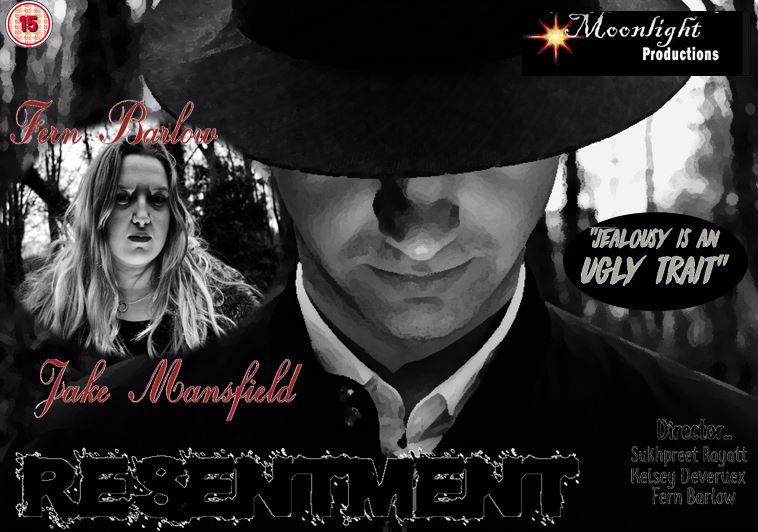
my film noir poster


As I did all the creative rolls within this project I thought this task would be very easy for me. I looked at  other existing film noir posters to gather inspiration and ideas. Most had a cartoon effect which made it more appealing to there audiences. They all include the main characters which appear on the front to show the audiences. Here I used Fern & Jake as the main characters, when positioned I enlarged Jake to fit the whole frame as I wanted only parts of his face shown and the rest hidden. I wanted him to look down as I wanted the light to project up directly to his face and create a silhouette effect from the hat. As I do A Level photography I took different camera angles and compositions to make it look more diverse and appealing to the audience. most of the posters I looked at were very vibrant and had the uses of yellows and reds.. however I wanted to keep it very dark and dull. I kept it minimal with red,blacks and greys which overall worked well. I used Da Font to get a range of fonts. I kept the resentment size 16 as I wanted it to stand out from the rest of the text. Overall im pleased with the final product and poster.