Sunday, 30 April 2017
production Sequence..
This production Sequence was created by my self. I used NCH software called express animate. I wanted to create a simple moving logo to represent our production company. I used minimal colours such as black and white to fit film noir with just a small splash of colour to appeal and attract the audiences. I used a range of different fonts to add more character. I kept the "moonlight" in a size 16 as suppose to the "production" which is size 14 font. I wanted the moonlight to really stand out as its our main name which represents us as a group. This will be shown at the beginning of our film noir, I think it will work effective as it will tie in with the black and white theme.
call sheet
| Scene no | Location | cast | script | props |
| 1 | crime scene | no one | 0 | Scarf, Newspaper & gloves |
| 2 | detectives staff room | Jake & Kelsey | 1 | Desk,lamp,paper work |
| 3 | office | Jake & Kelsey & Fern | 2 | Desk,computer,coffee cup,reports |
| 4 | office 2 | Jake & Fern | 2 | telephone,coffee cup, hat,notes |
| 5 | crime scene/woods | Jake & Fern | 1 | Scarf,gloves, bridge |
| 6 | office/meeting | Jake | 1 | phone,evedence,lamp |
| 7 | jakes house | Jake | 0 | evedence,alcohol,desk |
| 8 | woods/bridge | Jake & fern | 0 | hate, coat, red lip |
| 9 | woods/bridge | Jake & Fern | 0 | gun |
Thursday, 27 April 2017
Sunday, 16 April 2017
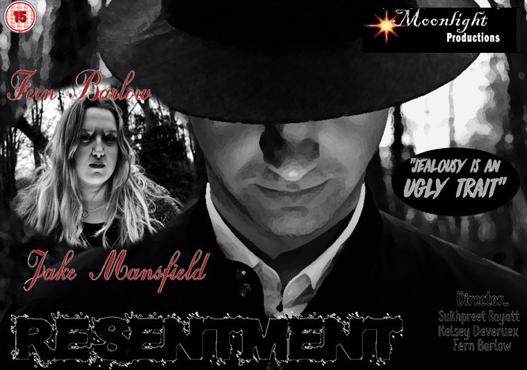
my film noir poster
As I did all the creative rolls within this project I thought this task would be very easy for me. I looked at other existing film noir posters to gather inspiration and ideas. Most had a cartoon effect which made it more appealing to there audiences. They all include the main characters which appear on the front to show the audiences. Here I used Fern & Jake as the main characters, when positioned I enlarged Jake to fit the whole frame as I wanted only parts of his face shown and the rest hidden. I wanted him to look down as I wanted the light to project up directly to his face and create a silhouette effect from the hat. As I do A Level photography I took different camera angles and compositions to make it look more diverse and appealing to the audience. most of the posters I looked at were very vibrant and had the uses of yellows and reds.. however I wanted to keep it very dark and dull. I kept it minimal with red,blacks and greys which overall worked well. I used Da Font to get a range of fonts. I kept the resentment size 16 as I wanted it to stand out from the rest of the text. Overall im pleased with the final product and poster.
Tuesday, 28 February 2017
storyboard
I have decided to work in a group with 2 other members in my class Kelsey & Fern, we have chosen to work as a group as we all have other commitments, so sharing tasks and taking on different rolls would make the process much more easier. As I do A level art I personally volunteered to take on this roll to create the story board for our film noir. Instead of using animation software I wanted to free hand draw each scene to make it look more realistic. This task was very In my comfort zone as im used to drawing all the time. I used movie maker to combine the transitions and to bind each scenes. Aswell as drawing the scenes I added music and special effects to really create the atmosphere we will want to create when creating the real product. overall am very pleased with pleased with the outcome of the story board as its clear to viewers about our storyline.
Subscribe to:
Posts (Atom)

